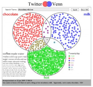
Twitter Venn takes two or three search terms and creates a Venn Diagram showing the rate of tweets containing the search terms in the various combinations. A tag cloud can also be shown for one of the regions.
This is one of the more interesting Twitter visualization tools. It tracks the usage of specific words in relation to each other, which quite honestly, is a terrific asset for linguists and people interested in social language. At the bottom of the diagram is a constantly moving stream of tweets which include the words you’ve highlighted and its quite an interesting way to pick up on random opinions featuring specific key-terms.
Have a go at it yourself. And if you’re interested in data visualization in general, don’t forget to check out Jeff Clark’s portfolio as well. Great stuff there.

Leave a Reply
You must be logged in to post a comment.